


Our Liturgical Calendar: Visual Thinking
Let us consider: the theology style-file.

For those that don’t know my work, I run a small theological art studio. Although I do comics day to day, I occasionally release massive projects.
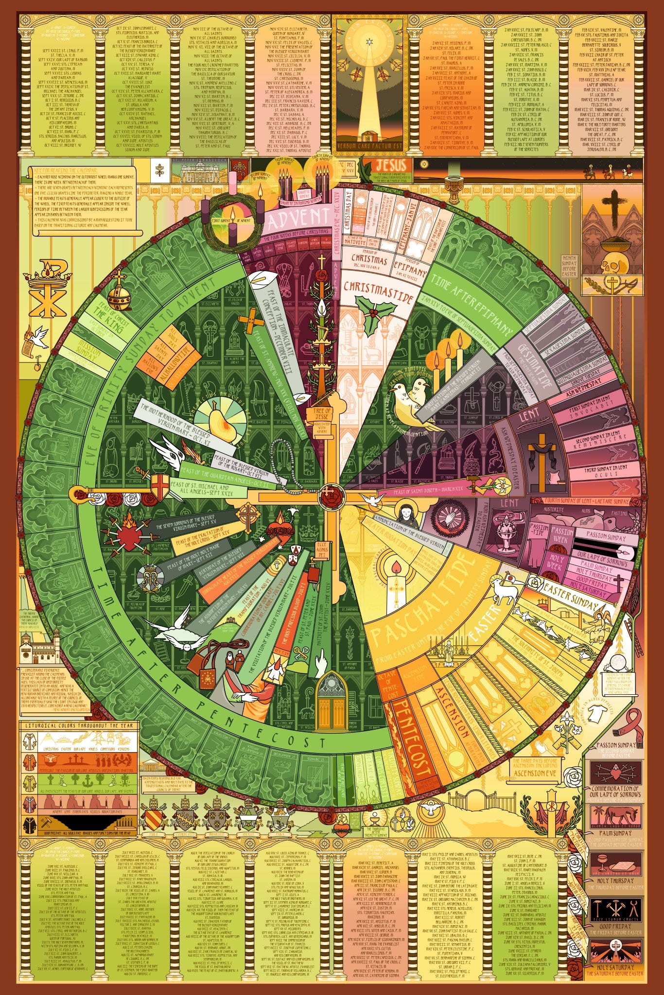
The most recent large project I released, prior to focusing on a few books, is a full traditional Catholic liturgical calendar.
This took me about two years start to finish. At this point, I’ve sold at least hundreds of them - but I’ve only gone into the details and the symbolic conceptions behind it a few times. That’s what I’d like to do here now, possibly in a series of posts.
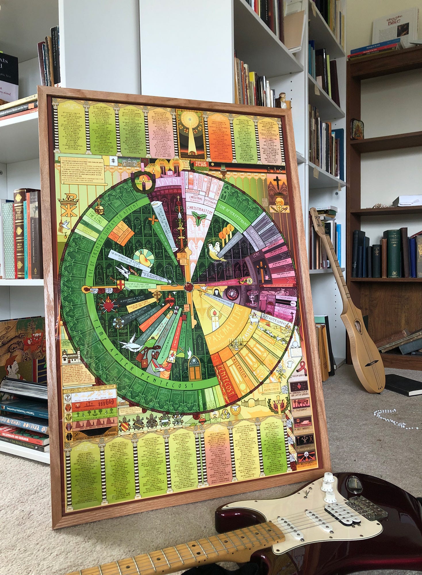
This the largest and most in depth thing I've ever made, easily. It was somewhat of a logical progression from my previous more serious, but smaller, images. The full print is two by three feet.

There’s a slightly spiritual art making principle I subscribe to which is that when you are invited or asked to do something, it’s more likely to take on a life of its own.
That was the case with this. A man commissioned me to make this in a style and with dates that would be suitable for those attending the traditional Latin mass - which, if you’re not a huge nerd, basically uses some slightly different dates and content than the post 1960s calendar.
The process of gathering the data for this was itself somewhat immense. I looked through many pre-1960s missals in their entirety, and consulted with a few people who were especially generous with this time and expertise. There’s so much writing that it took me a full week just to check through the text before sending it off to print.
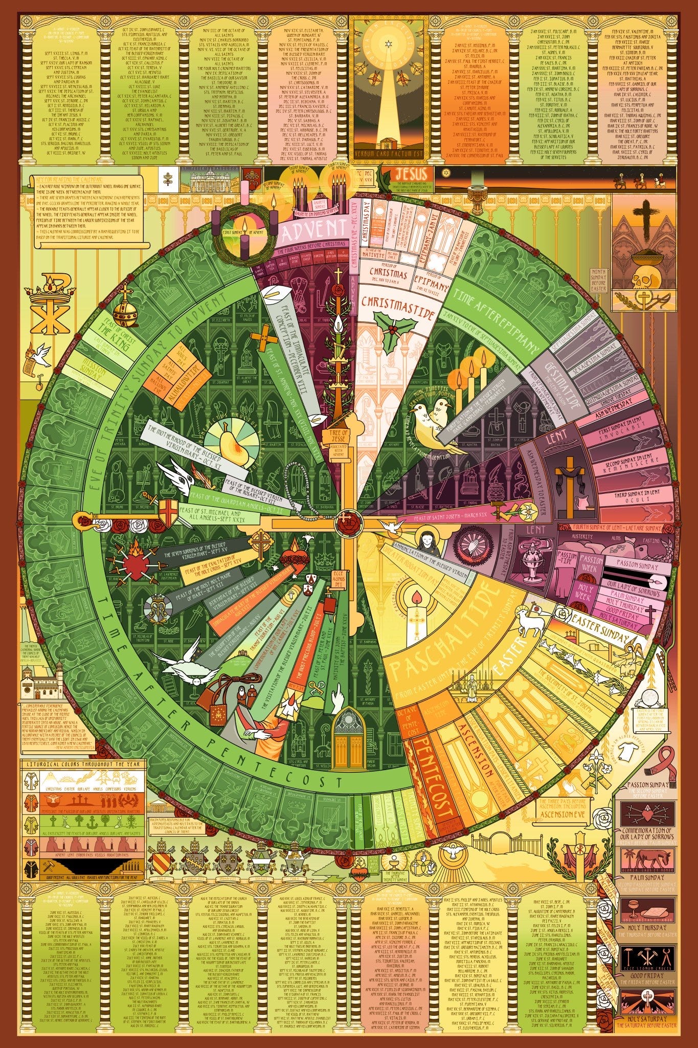
Here you can see the four separate quarters:
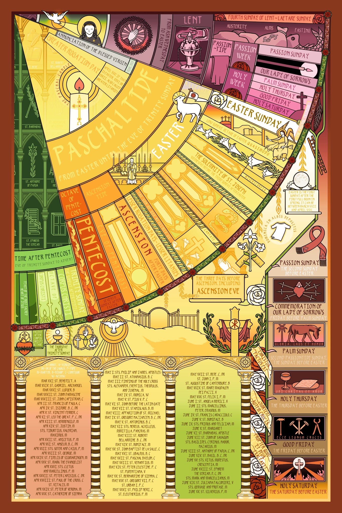
The first obstacle I hit was creating a single wheel that could display both the movable and immovable feasts.
Movable feasts… move. They’re mapped relative to Easter, which changes every year. If you asked when a movable feast is, you might get an answer like “eight weeks after Easter”.
This is different from immovable feasts. Most people would be familiar with the fact that Christmas is December 25th every year - it doesn’t move.
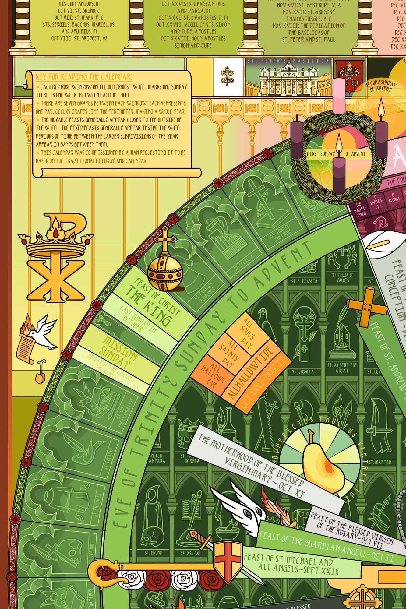
This created a small design obstacle. Let’s take another well known immovable feast: All Saint’s Day, on November 1st (thus All Hallows Eve, or Halloween, is always October 31st). Some years, certain movable feasts will be before Halloween. Some years, those same holidays will be after Halloween. So, I had to figure out how to place these together into one visual system.
I had to display all these days in a way that would apply to every year, always, and never be incorrect or visually confusing. My solution to this was two interlocking wheels:
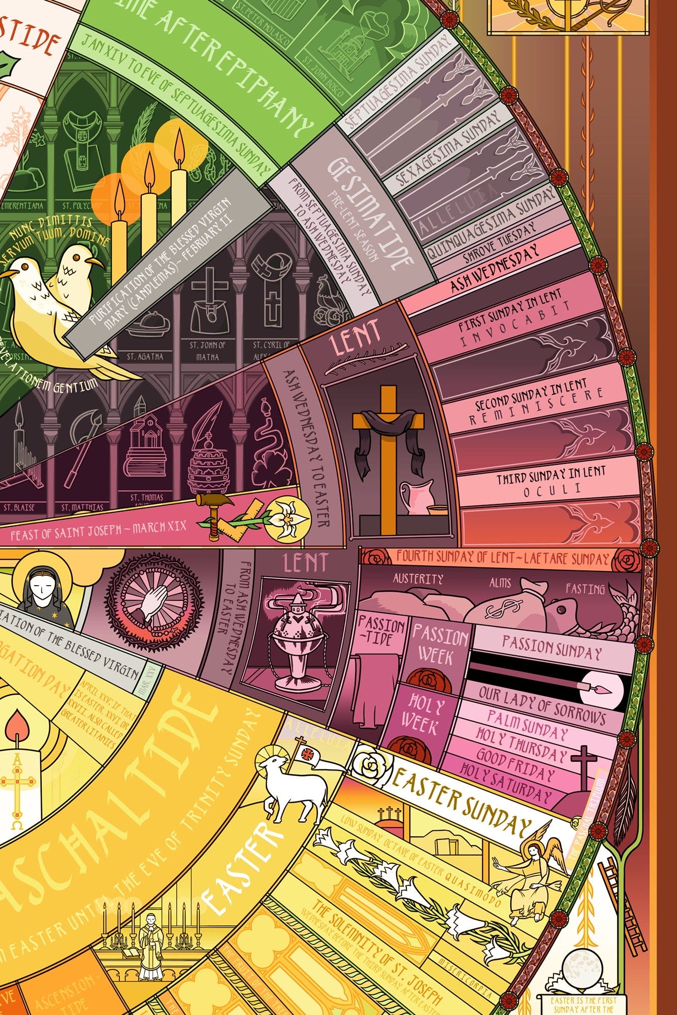
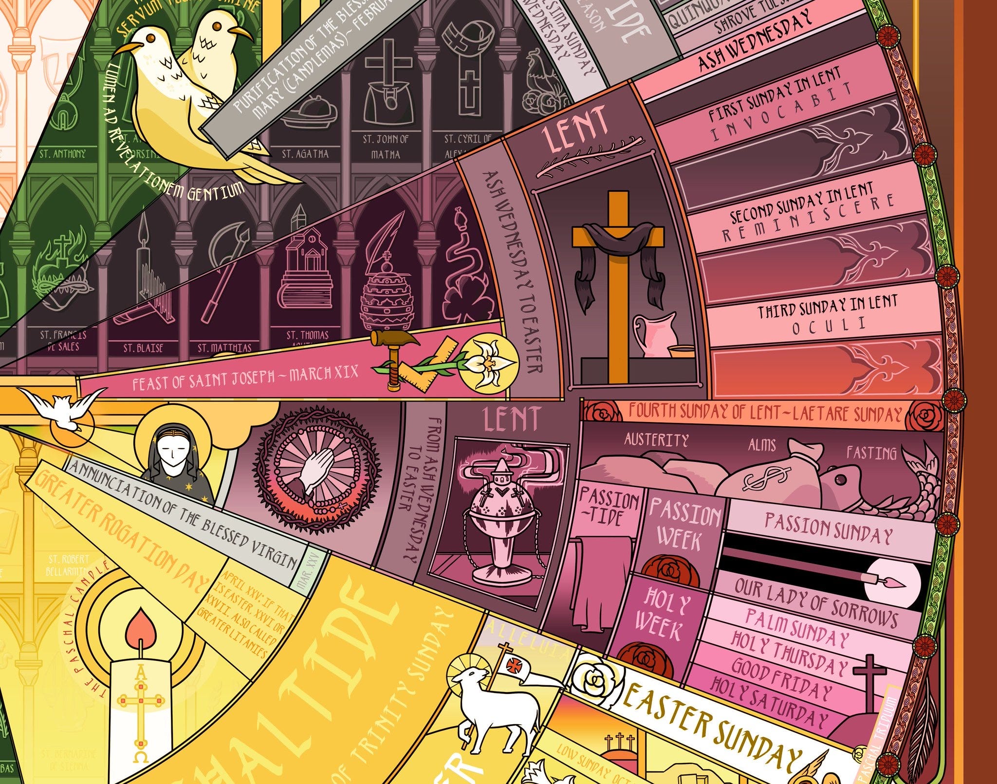
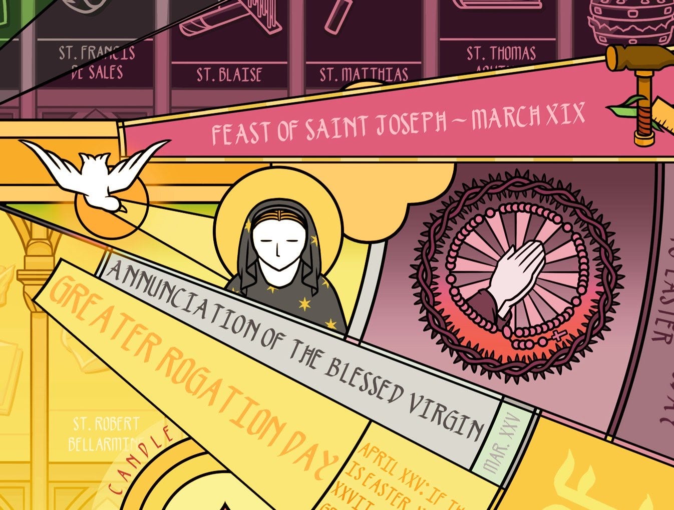
Below you can see, for example, on the left we have Candlemas, which is always on the same date. How do we visually display that with the holy days on the right, like Septuagesima Sunday, that move every year?
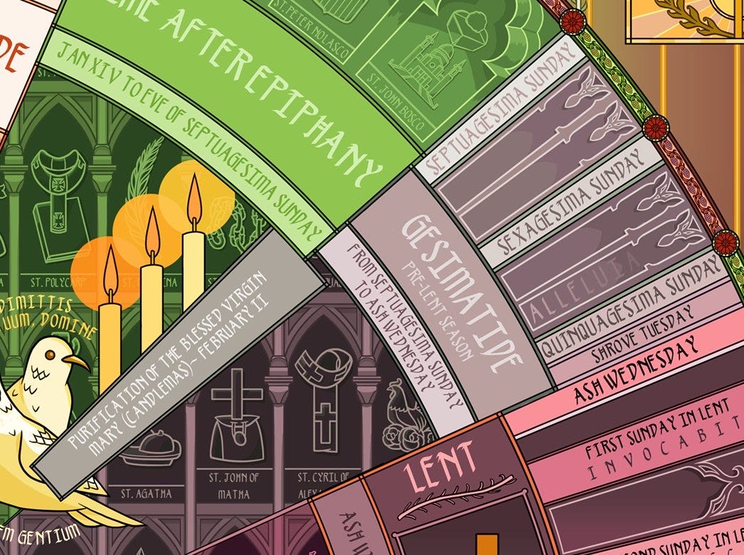
I used large banners designating the liturgical seasons (here, Gesimatide) as a visual separator. Generally, fixed dates appear inside of it, closer to the center. Movable holy days are outside, closer to the edge. This allowed me to make sure two holidays that could potentially change order were never forced onto the same visual path.
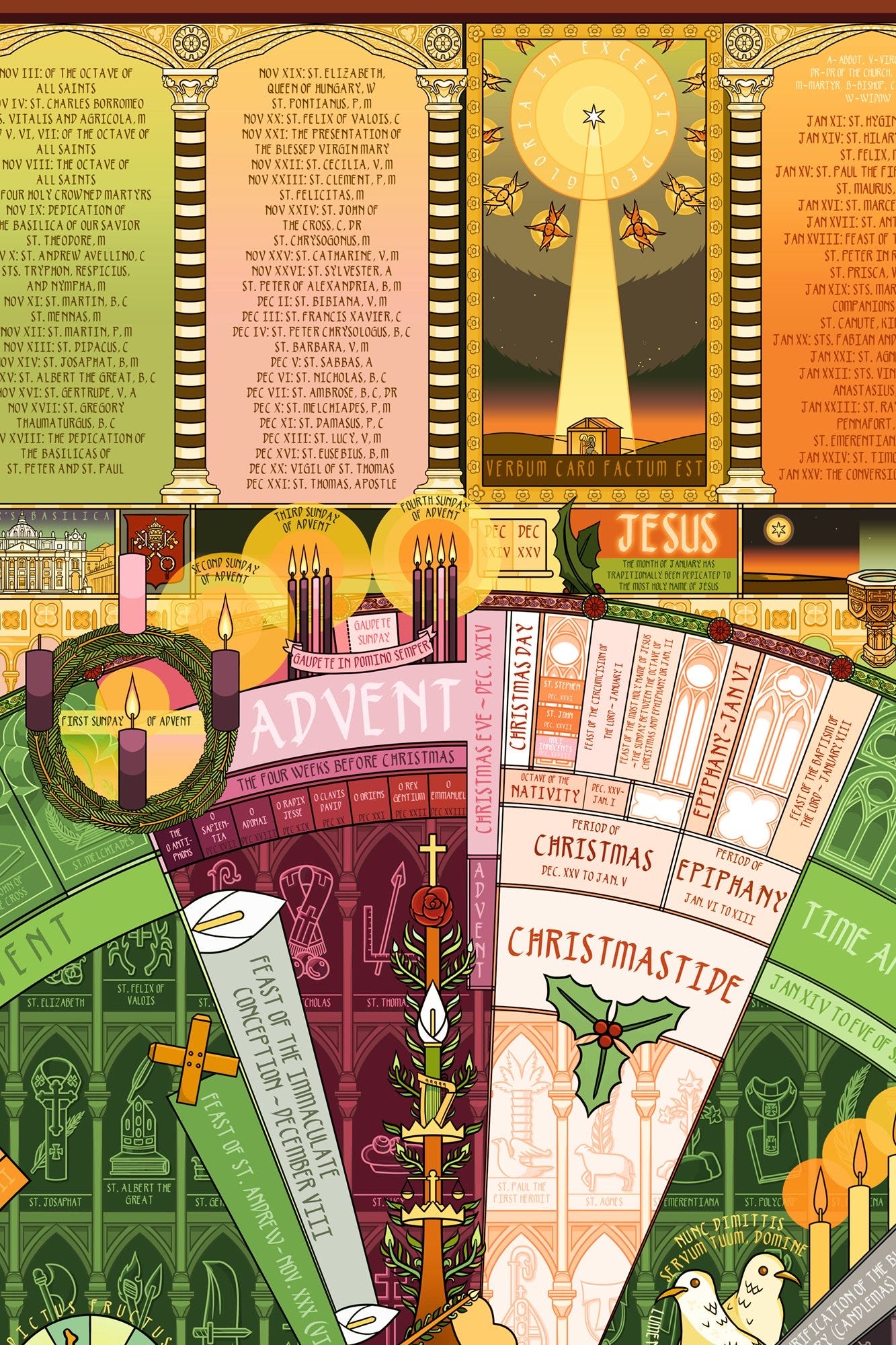
With this system, we can display the feast of St. Joseph (which has a fixed date) on the same wheel as Laetare Sunday, which moves every year. If one year, Laetare Sunday comes first, and the next year, the order is reversed, it still reads fine visually because the intermediary space of the purple 'Lent' banner, with imagery and the days that Lent start and end, is separating them:
This also allowed me to fit what I believe to be a relatively sophisticated soft dating system in.
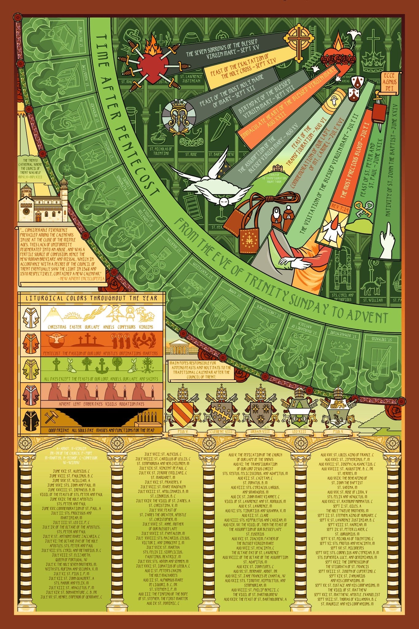
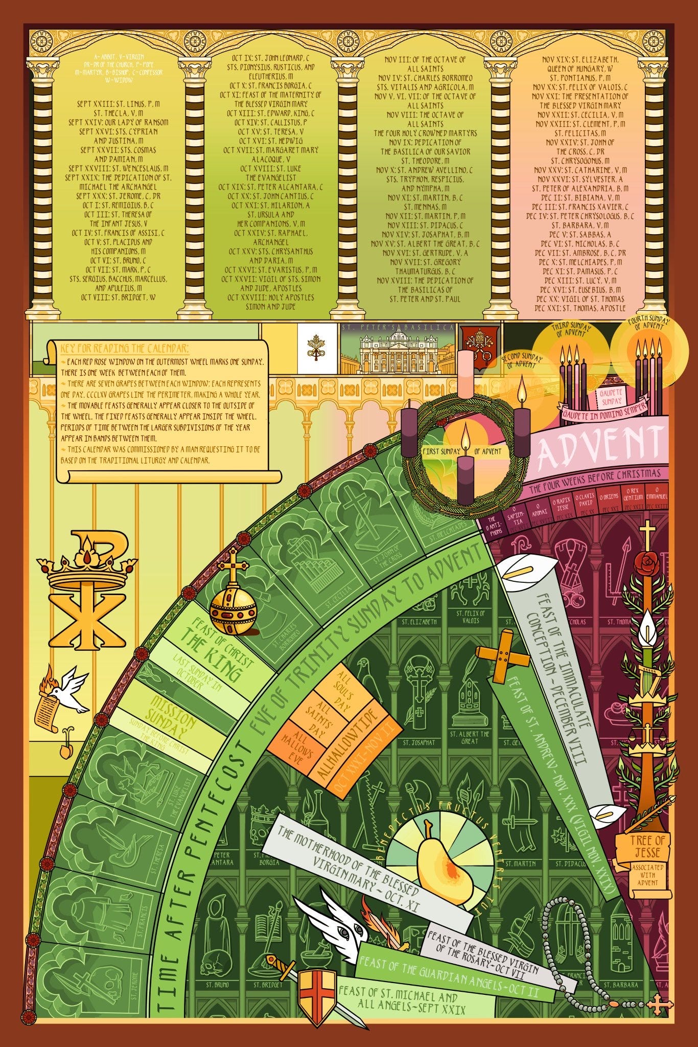
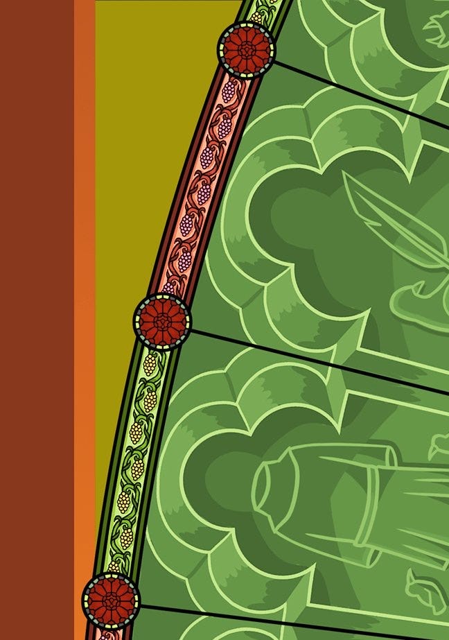
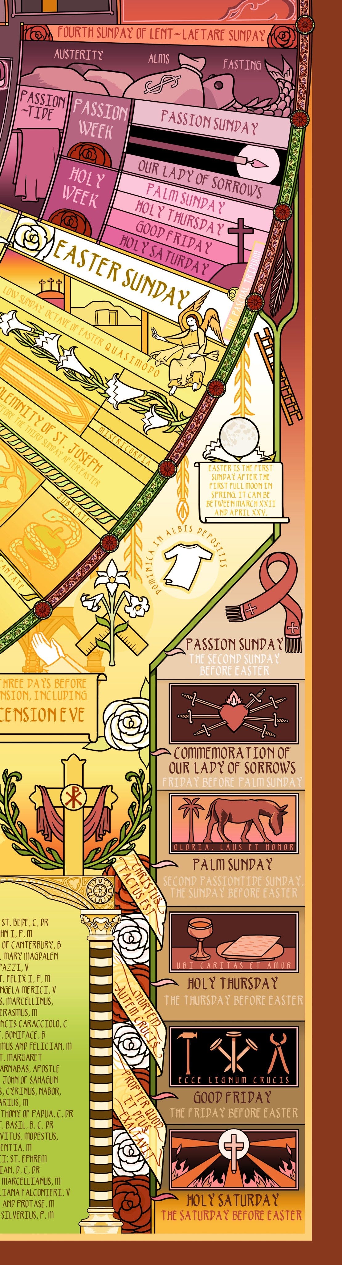
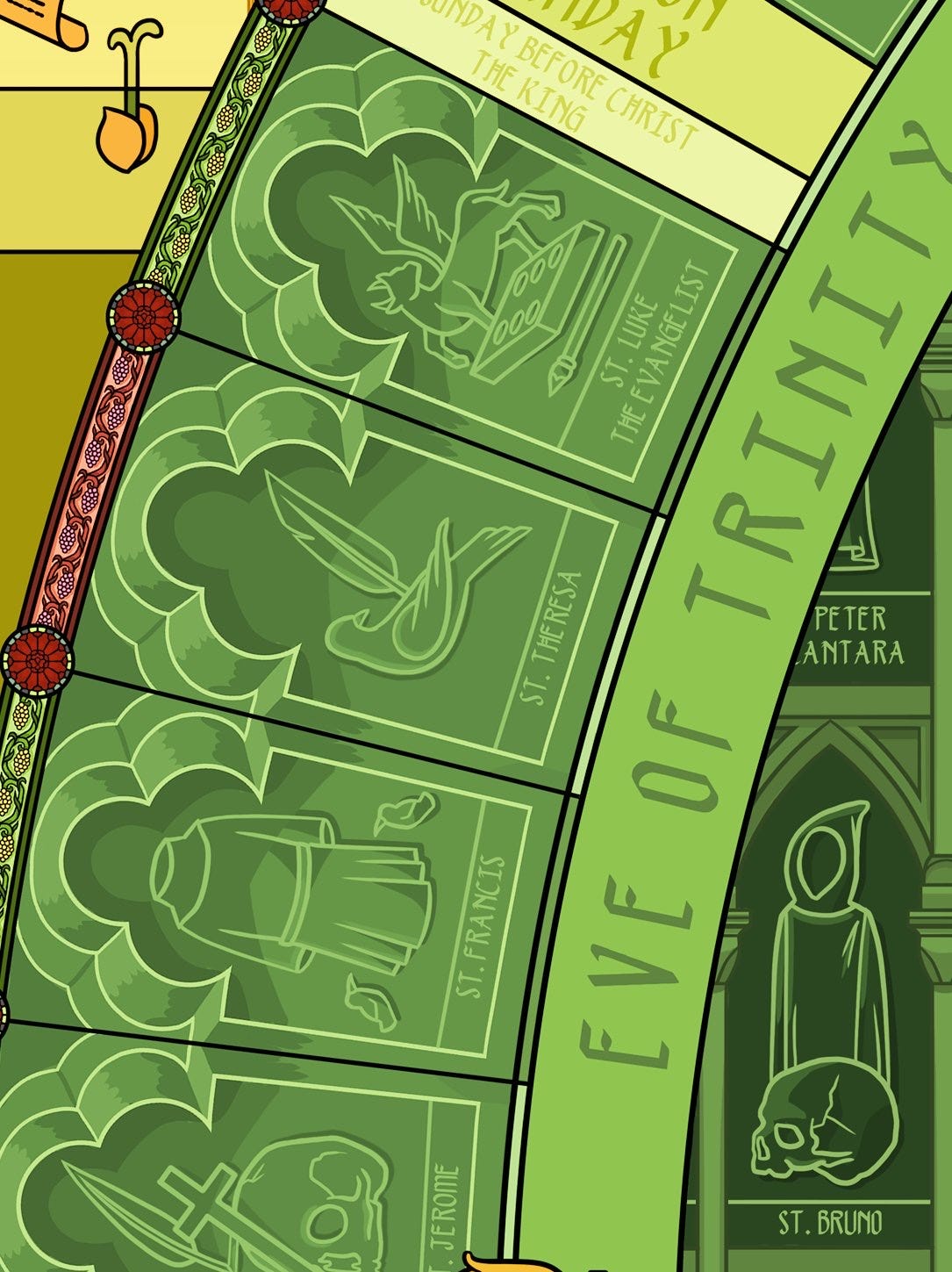
On the left, below, you can see that there are stained glass rose windows running around the wheel. Each rose window is one Sunday - so, there's 52 of them. Each banner between them is one week.
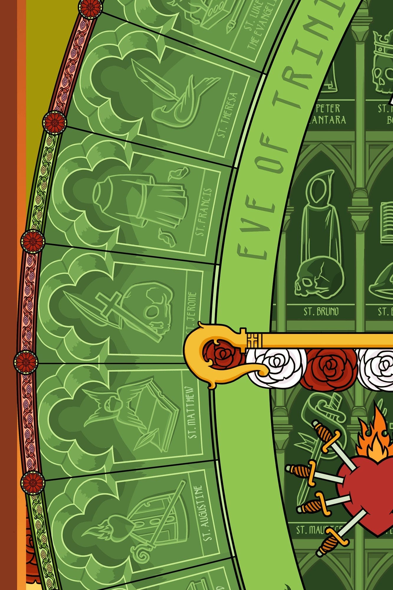
Each space between these windows has 7 grapes. So, 365 grapes line the wheel - obviously one for each day:
I also wanted to capture the feeling of moving through the whole year - I wanted the visuals to mirror the change you feel internally as the cyclical year progresses.
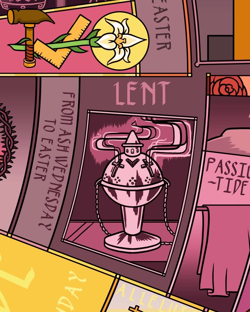
If we go back to the whole image, you can see some basic elements of this: Lent is darker, Christmas is bright and warm, between the start of Lent and Pentecost it feels very packed and busy because so much is happening - then on the left, that packed season ends, and you can feel more visual room to breathe:
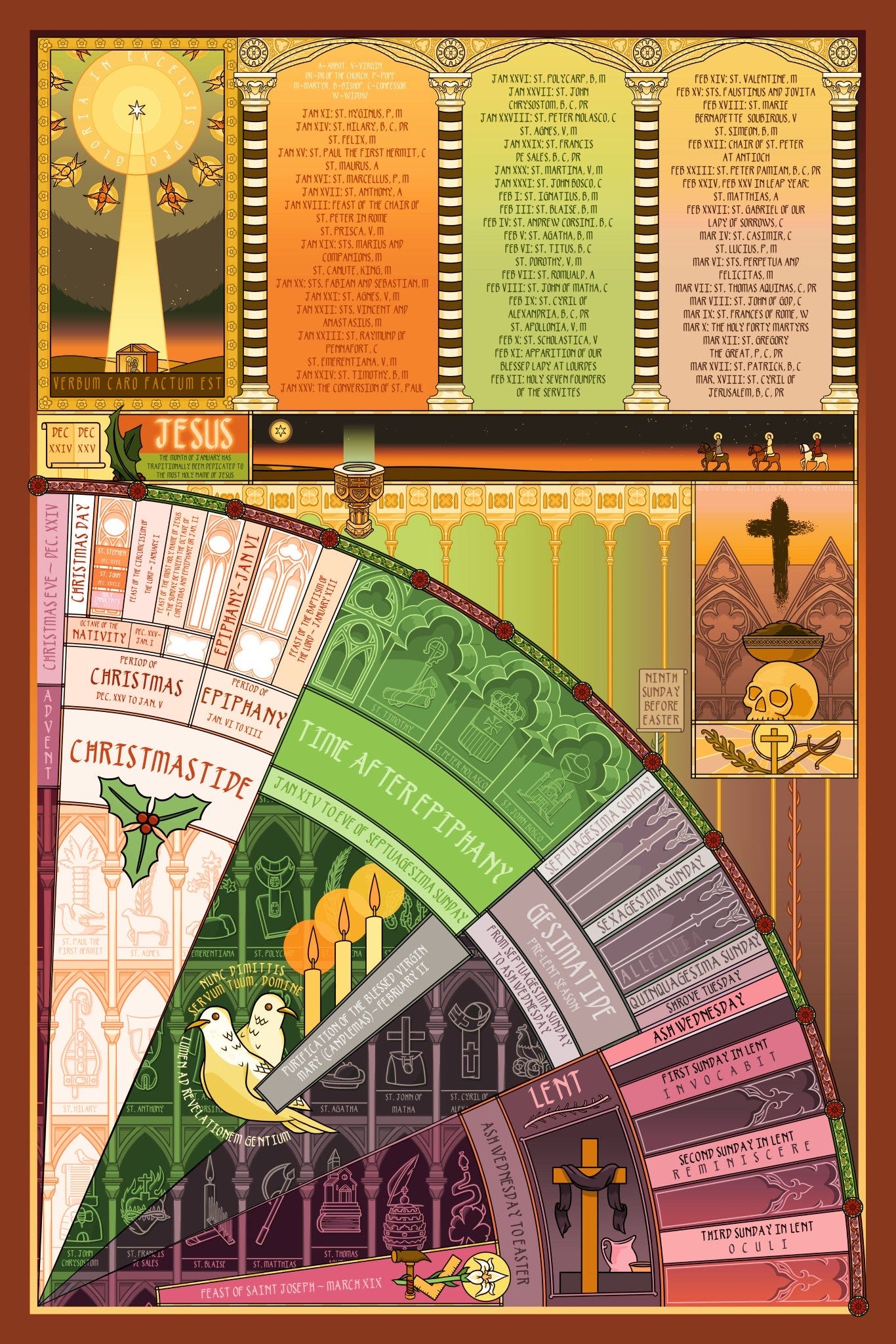
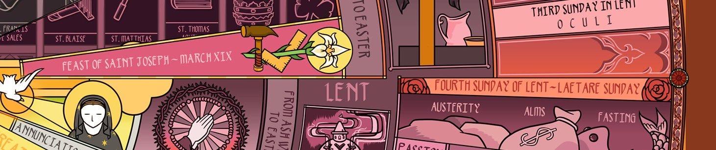
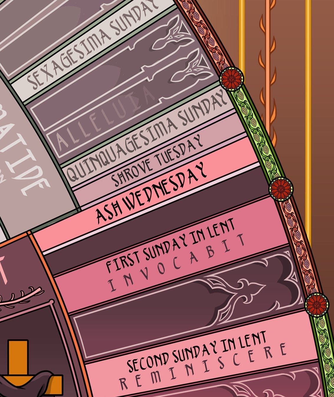
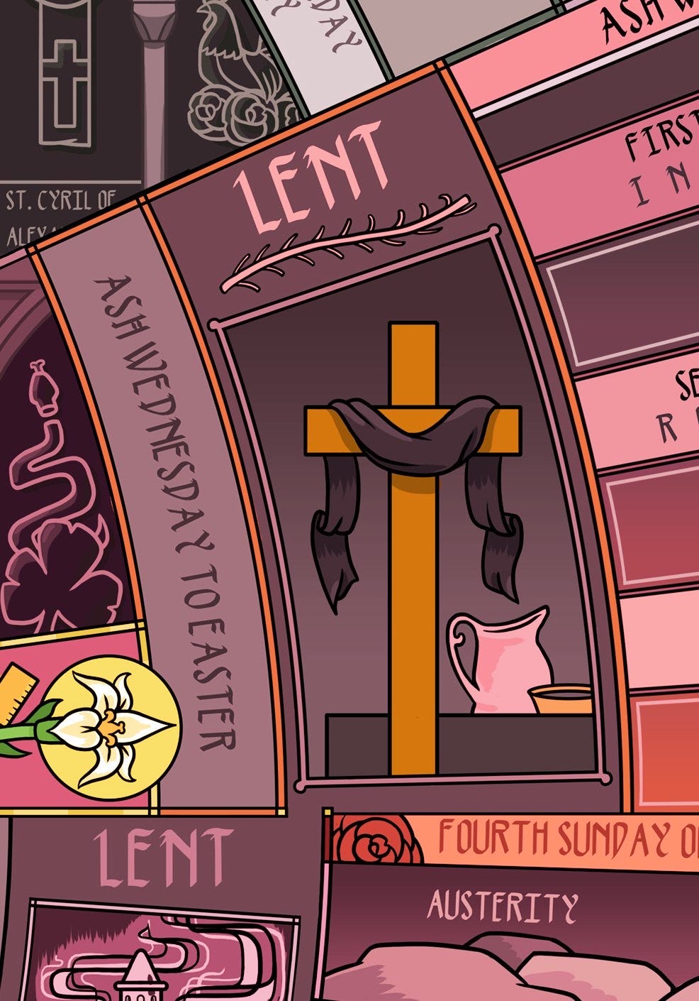
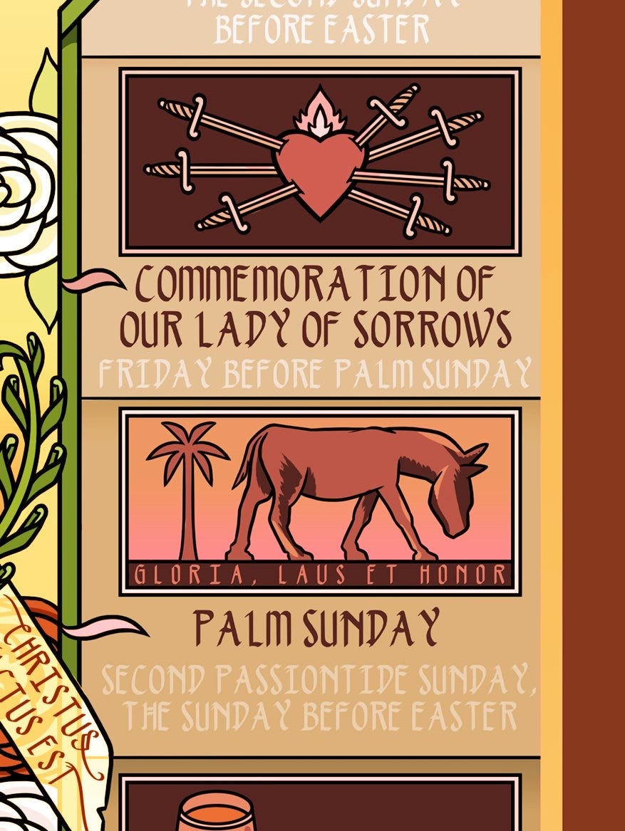
Thematically, Lent was the most straightforward. Dark, Lent has its own symbolic paradigm, slowly building up to Easter. If you look at the windows under the 1st, 2nd, and 3rd Sundays here, my goal was for details like these to always work in harmony with the larger spiritual themes:
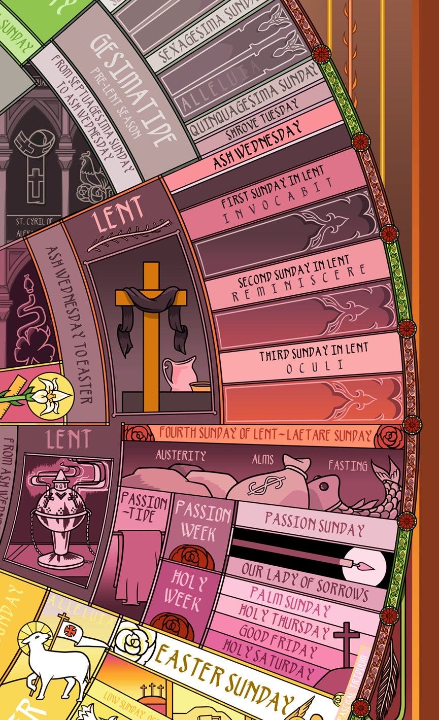
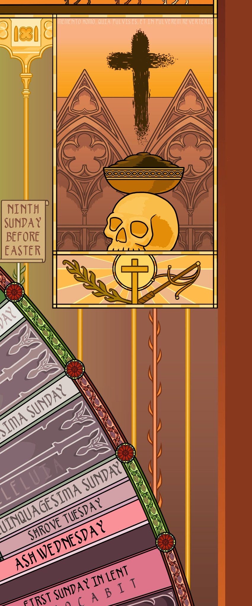
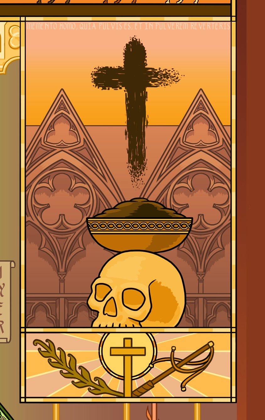
If we rewind to slightly before Lent, below, above Quinquagesima Sunday, you can see a fade out marking where the word "alleluia" leaves the services (it remains unspoken until Easter). I love this detail - it’s something that someone else more familiar with the liturgical process suggested to me.
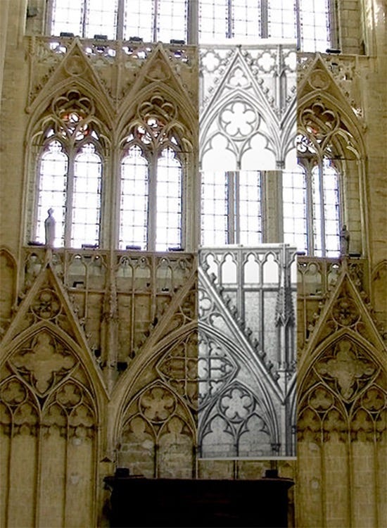
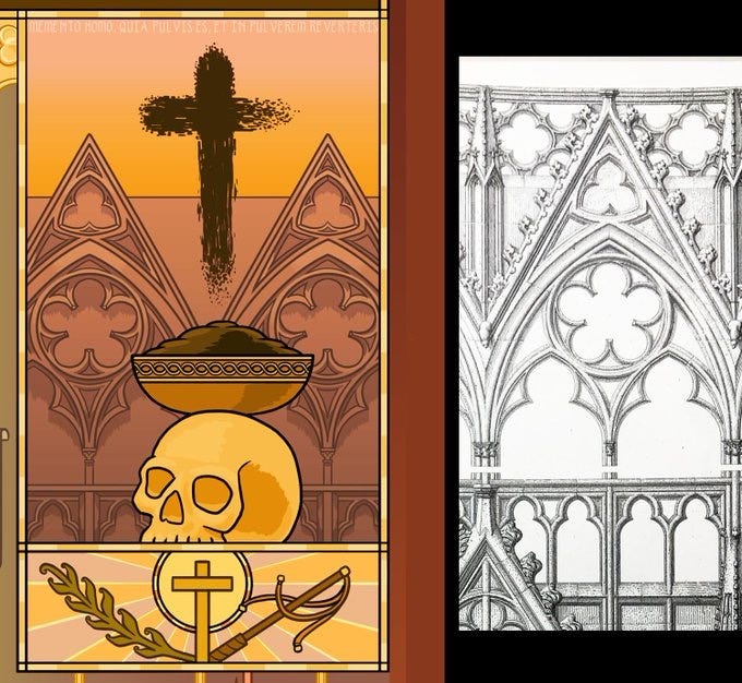
The vine from Ash Wednesday leads up to this image. The architectural details you see here are from a real cathedral, in Meaux, France:
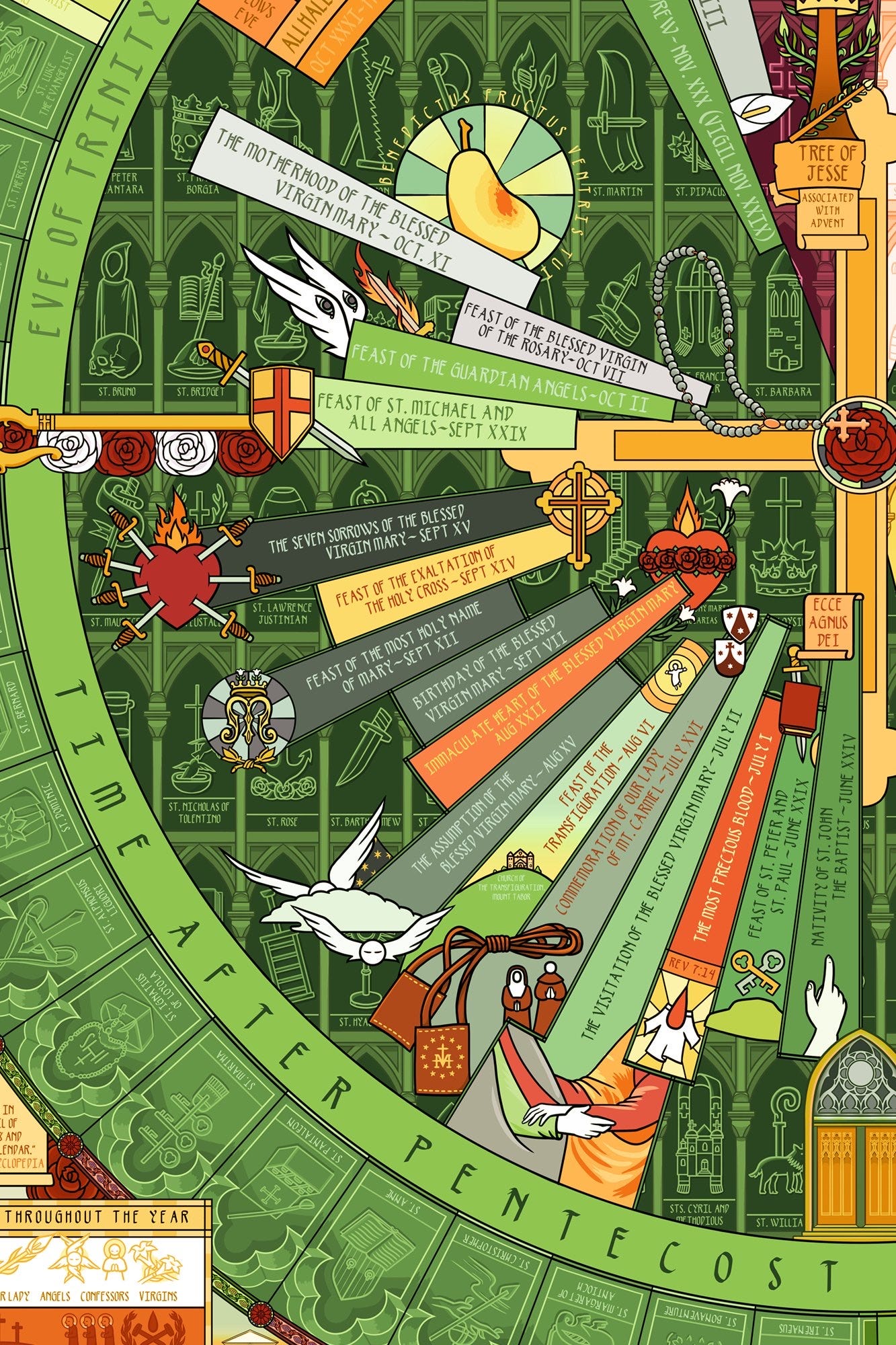
Further inside the Lent section of the wheel, you can see the annunciation, next to a rosary image. Fitting the different visual styles together in a way that felt natural and light was also a significant part of the process:
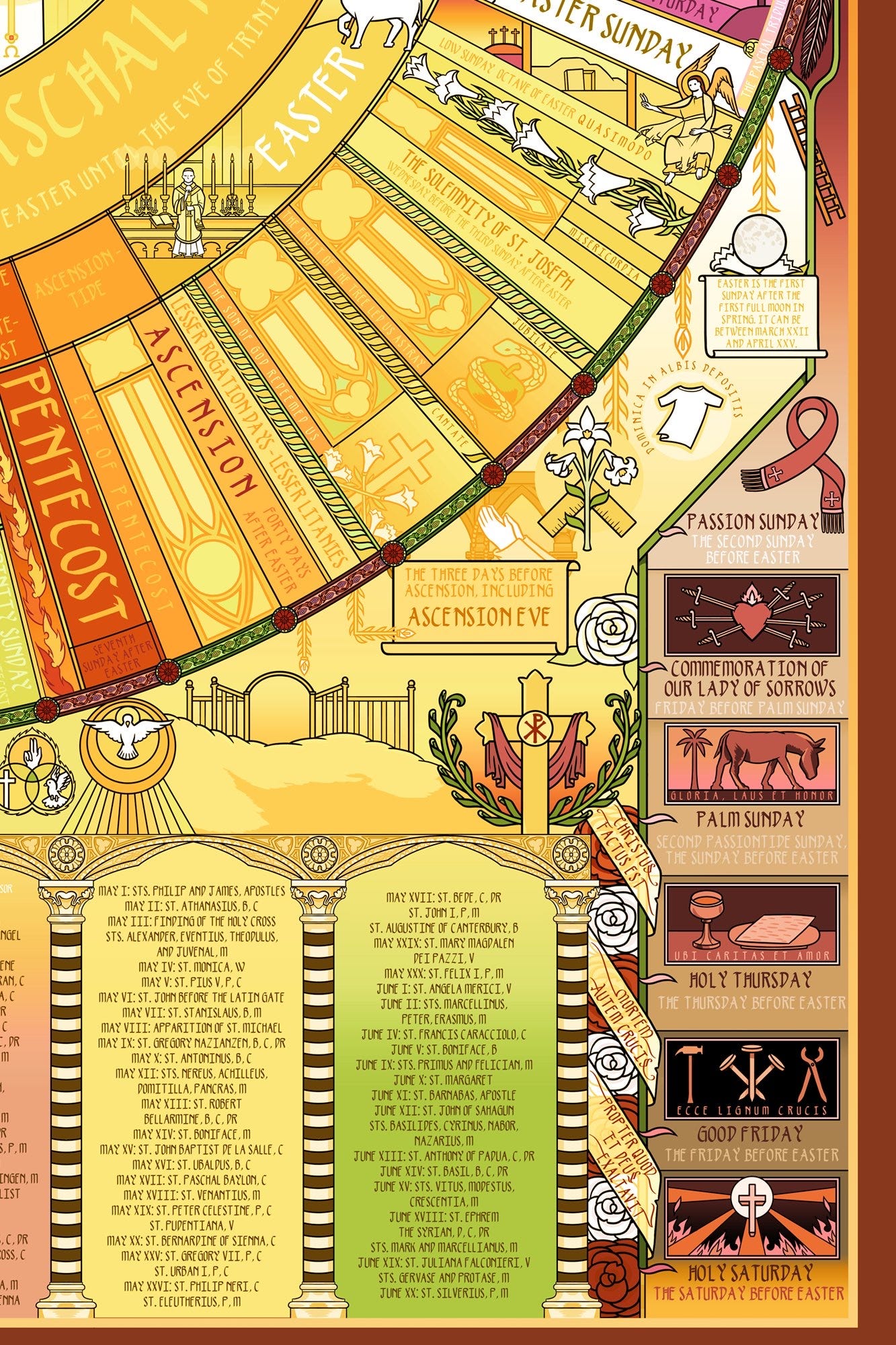
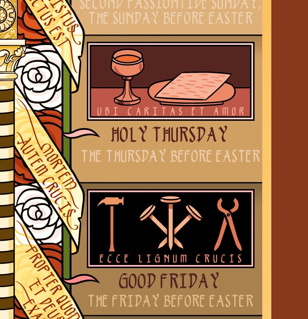
The dichotomy of light and dark may be the most universal spiritual symbolism. Here, when we get to Passiontide and Holy Week - it gets progressively darker, then Easter is a somewhat explosive luminous transition out of that darkness. This section and theme, led by a vine, extends down out of the wheel.
As you read this section, visually you are descending, further into the increasing darkness, until the Harrowing of Hell - which obviously fits thematically (Christ’s descent into Hell):
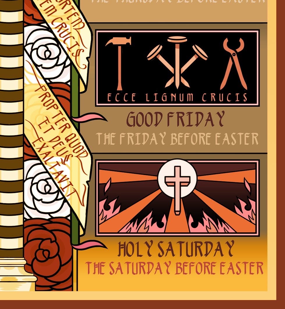
Even the roses get darker as you go down here, behind the illumined banner. I was very pleased with the descending almost spiral staircase-like effect here. You can see it in at a distance in terms of the whole image if you look in the bottom right corner here:

Soon we’ll do more posts about aspects of the more formal theological visual style that I rarely get to explicate. I believe that next up will be: saints and fonts.
If you’re interested, I do sell prints of the calendar framed or unframed. I’ve gotten great reviews on it from normal people, weirdos, clergy, at least one monastic, and my dog.
You can find it in my etsy store here, with reviews, or it’s available directly from me in my own shop here.
Thanks for taking the time to scope the vibe.
One of these hangs in the Princeton Catholic student center!
my goodness this is beautiful 💖
stunning work, Mr Cyclops!!